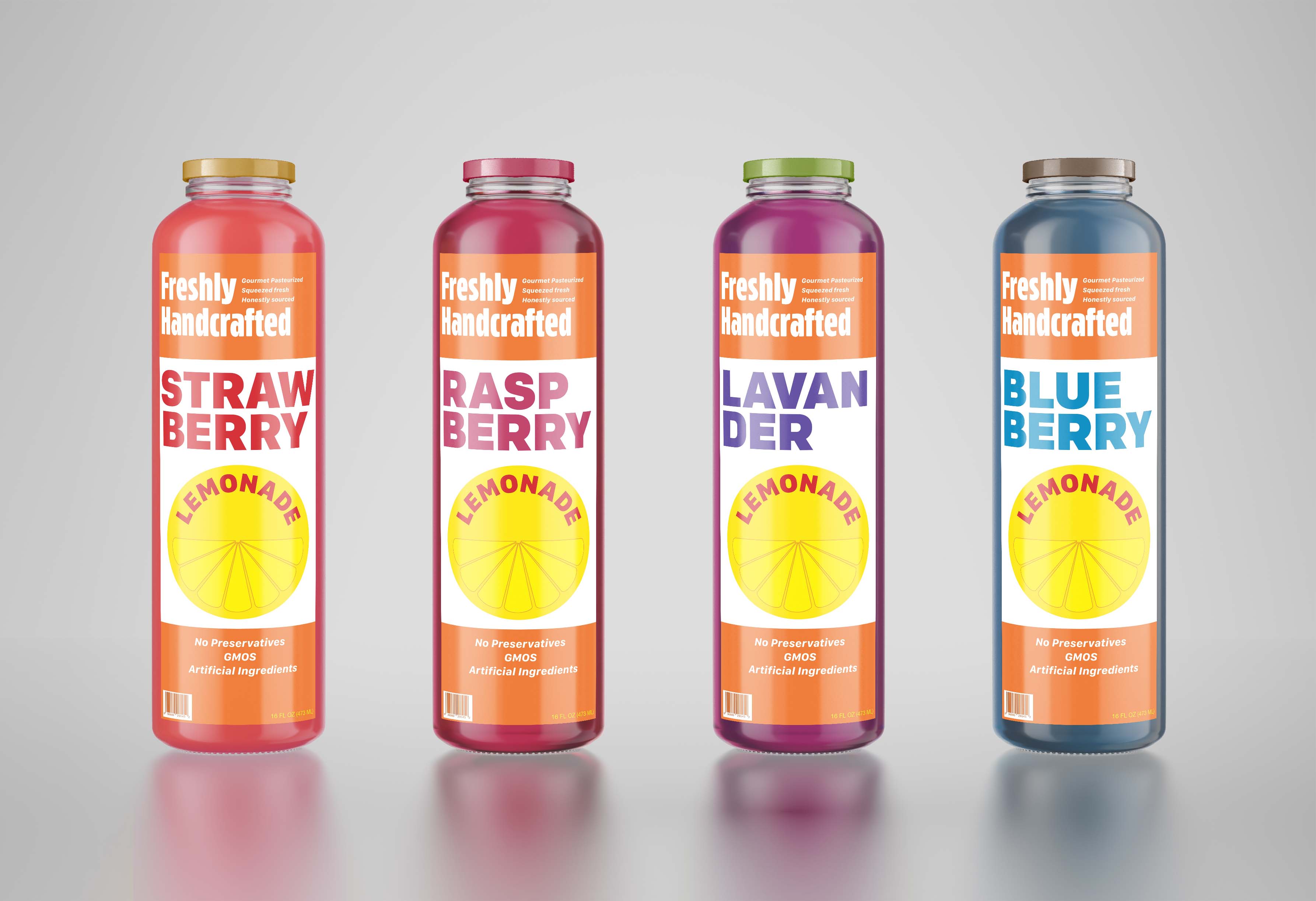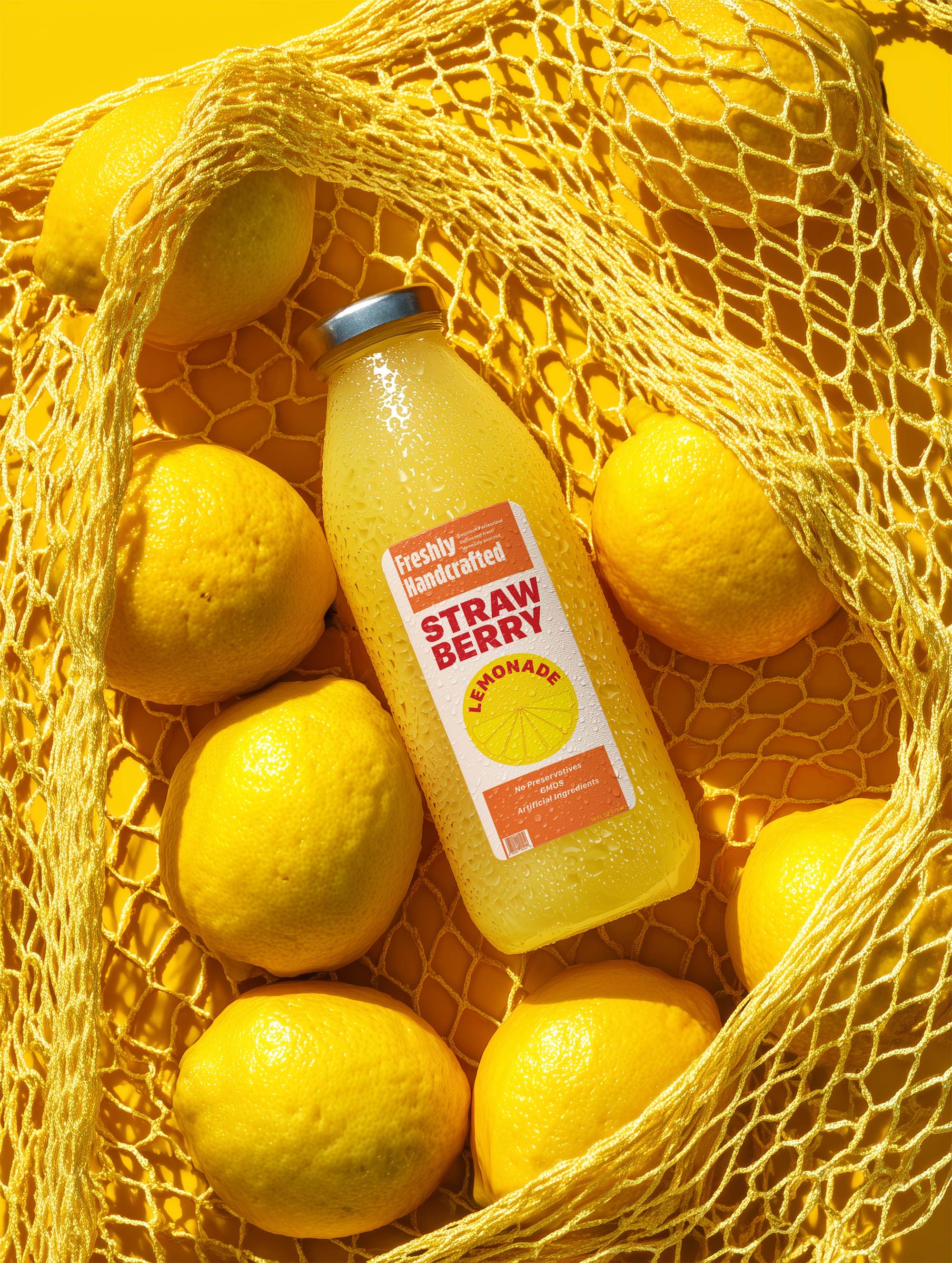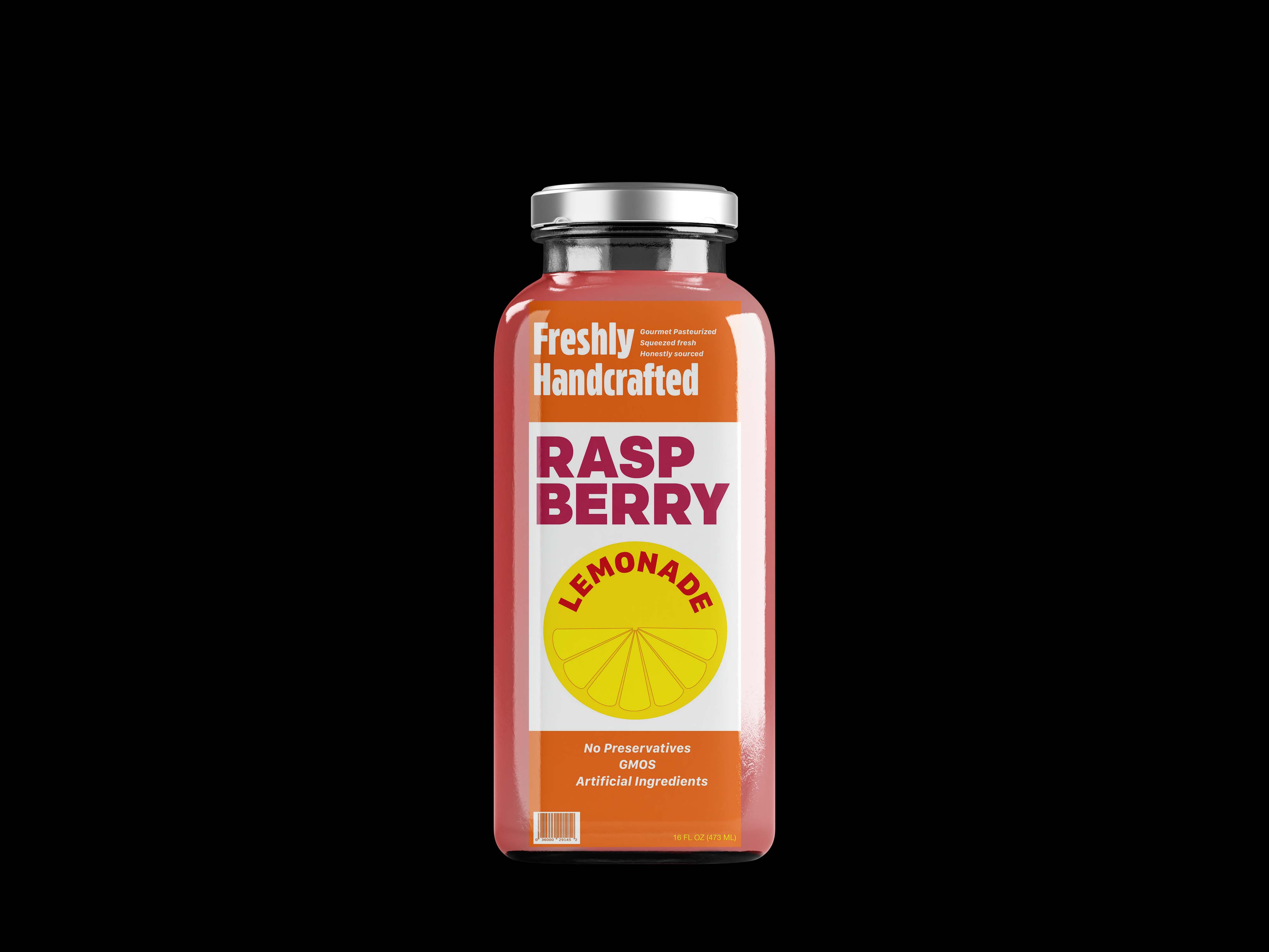
Melanie's Orange Juice

The Challenge:
Melanie’s is a family-operated, women-owned juice company with over 30 years of history rooted in Florida's citrus groves. The challenge was to create a typographic design and visual system that honors this heritage of craft, authentic freshness, and small-batch quality. The design required combining two distinct typeface families with technical ornaments—such as flourishes and vector lines—without letting the decorations overpower the text, ensuring a clear and professional hierarchy.
The Solution:
A clean, minimal design system engineered to adapt easily across various flavors, starting with their signature lemonade. I drew creative inspiration from mid-century modern designs of the 1967–1977 era, specifically the iconic, structured work of the Sainsbury's Design Studio. The color palette directly reflects the brand’s roots, utilizing a warm orange to represent the family's citrus groves and a vibrant yellow for the fresh lemonade product line.